Guide to universal design in PowerPoint
PowerPoint is a visual medium. This means that the main requirement for presentations is to ensure that the visual information is as easy to understand as possible for anyone using aids to acquire the information. One such aid could be a screen reader.
Use the HVL templates
In Vestibylen you can find PowerPoint templates with HVL's theme. These are a good starting point for a universally designed presentations.
www.hvl.no/malar (only available to employees)
Text formatting
- Use the built-in functions in PowerPoint to structure the text so that it is well organised and easy to follow, including for people who have the text read aloud by a screen reader.
- Stick to easily readable fonts or standard fonts such as Arial and Calibri. Avoid special fonts with a lot of graphic embellishment or which resemble handwriting or joined-up writing. We recommend font size 24, but no smaller than 20.
- Use bold to highlight text. Underlined text should be reserved for links, and italics should only be used in small quantities. Also, do not use CAPITAL LETTERS, since the screen reader tool may shout when it reads this text aloud.
- If you apply color on the text, keep an eye on the contrast. Dark on light and light on dark is the safe choice. You can easily check contrast on the entire document by uploading it to Canvas and see what Ally says.
Slide titles
- Give each slide a unique title, to make it easy to skim through the presentation or use a screen reader to quickly search through the list of slide titles and jump to content.
- Want a slide without a visible title? Add a hidden slide title. You can find the function by clicking "Accessibility: Investigate" on the the bottom left, and then going to the top menu under "Slide Title" where you can click "Add Hidden Slide Title". This way, it is still possible to navigate in your presentation. Alternatively, you can add a title like normal and manually move it out of the slide surface.


Lists
- Lists, such as bullets and numbered lists, should be made using the bullet or numbering function.
- This is because people who are using aids such as screen readers often have a function which allows them to navigate lists. This way, they get information about the number of points in the list.
![]()
Pictures and illustrations
Images are a visual tool, but not everyone has the ability to see the content. Here are a couple of important things to think about when you use pictures and illustrations.
Alternative text
- If you use pictures and illustrations, there should be alternative text describing the content of the image. This allows people who cannot fully see the image to understand its contents.
- A good alternative text includes the most important information, is relatively brief and describes the subject of the image.
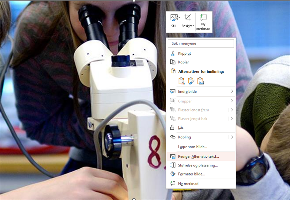
- Enter alternative text by right-clicking and selecting "Edit Alt Text".

- Pictures do not need alternative text and can be designated decorative via the same function if:
- The picture has already been described by text near the picture
- The picture acts as an illustration to text but does not provide any new information
- They provide visual embellishment such as frames, arrows or other shapes
- They provide decoration for links or buttons to make them stand out
- If the picture or illustration contains a lot of information, you must include a detailed explanation of the content.
Text in images
- Wherever applicable, you should not use pictures of text. As a general rule, text should be written out in the document. Pictures of text do not convey the information to people using aids.
Images with movement
- Using images with movement (GIFs) can be an appealing way to make a PowerPoint more exciting, but be careful with use. Some people can become unwell from repeated movement they cannot pause. Movement also draws the eye away from other information.
- Be careful not to use GIFs or videos with fast flashes. More than 3 flashes per second can trigger epileptic seizures.
Diagrams
- When using diagrams, the alternative text should briefly present the purpose and main information in the diagram. You should also present the values in the diagram.
- Diagrams are often designed with colours to convey information. It may be appropriate here to think about colour-blind people or people with colour vision deficiency, who find it difficult to differentiate between certain colours. One way of doing this is to ensure that the information is available via means other than colours. Another way is to use patterns in the diagram, or use the Styles tool and find a version which displays figures directly on the chart.

You can also click on the Plus icon, “Data labels” and then “Data Callout”.

Examples of good charts:

Reading order
- It is important for seeing readers and screen reader users to read the content in the slide in the order intended.
- A screen reader reads objects in a slide in the order that they have been assigned. For example, if a bullet list is assigned above its heading, a screen reader will read the bullet list before the heading. If the reading order is wrong, this can make the entire document impossible to understand for anyone using a screen reader.
- The easiest way to define the reading order is to open the “Arrange” function, choose Selection Pane at the bottom and arrange the order of the objects there. In the Selection Pane, you can move objects by using the up and down arrows, or by dragging and dropping the objects.

Language
In order for a screen reader to read content in the correct language, the language must be defined in the PowerPoint. You check this by selecting one or more elements and seeing which language appears in the lower left corner of the program.
If you want to change the language of an element, you can do this via "look through", "language" and then "set language". Or by pressing the language displayed at the bottom left of the program.
Tip: If you want to set the language to Nynorsk or Bokmål, you can quickly find them in the list of languages by pressing "o". Pressing "e" works for English, but requires a bit more scrolling to find US or UK English.
Tables
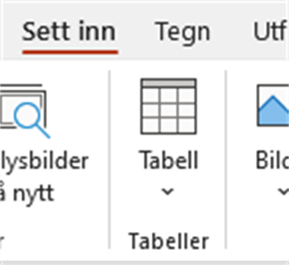
- It can be difficult for people using aids to find their way around and navigate in tables. Using and labelling header rows correctly is vital for accessibility. You should therefore use the table function in PowerPoint via “Insert” in the toolbar and then “Table”.

- Remember column headings. To create headings in tables, click anywhere in the table, and select header row/first column or both, depending on what you need, in the tools menu at the top left.
- Note! Make sure that the table does not contain split cells or merged cells. Make sure that none of the cells are empty, since this can cause problems for people using screen readers.
- Also consider whether there are other ways that you could present the content. Does it have to be a table?
Links
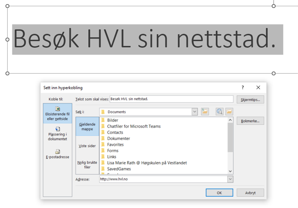
- Links should have a descriptive link text, making it easy to understand what the destination of the links in the presentation is. Either in the link text alone, or in the link text and the text around the link, you must clearly describe what the destination of the link is.
- To insert a link, go to “Insert” and select “Link”. Paste the link address into the address field, and the description text in “Text to display”.

- It should also be easy for the user to see the links in the document. In PowerPoint, links are automatically underlined, which means that you do not need to add anything, as long as you make sure that the link is in the form of a hyperlink.
Videos
- Videos that are built into a presentation must have captions to ensure that the audio information is accessible to people who cannot hear, or who are viewing the presentation without audio.
Review and check accessibility
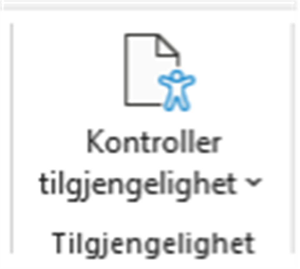
- The accessibility checker in PowerPoint is the same as in Word.
- Go into “Review” or “File” and “Check Accessibility”. You can also find this at the bottom left. The function gives you information about whether the document is accessible, or whether you should inspect it and change specific parts of the design.

